The anatomy of a high converting landing page is not a prettier webpage; it is a single-purpose path that moves one specific visitor from problem awareness to confident action. In this guide, you’ll learn how to structure the page, write the offer, design the lead capture flow, and improve conversions after launch.
The Anatomy of a High Converting Landing Page
A landing page is a campaign-specific conversion asset, not a mini website. Its job is to turn traffic from an ad, email, search result, social post, webinar invite, or referral campaign into one measurable action: a demo request, consultation booking, download, signup, quote request, or purchase inquiry.
The anatomy of a high converting landing page usually includes message match, a clear hero offer, benefit-led copy, proof, objection handling, friction removal, and one obvious call to action. Every section should do at least one of three things: increase motivation, reduce anxiety, or make the next step easier.
Start by designing backward from the desired lead action. If the goal is a demo, the page must build enough trust for a sales conversation. If the goal is a checklist download, the page should make the value immediate and the form lightweight. The stronger the ask, the more proof and reassurance the page needs.
Start With One Offer, One Audience, and One Conversion Goal
High-converting pages begin with focus. Define the exact audience segment first: “operations leaders at growing B2B SaaS companies” is stronger than “business owners.” Then name the pain point that brought them there, such as slow onboarding, missed follow-ups, poor reporting, or low-quality leads.
Your offer should answer three questions in concrete terms: what does the visitor get, who is it for, and why does it matter now? “Get a 20-minute audit of your lead capture process” is clearer than “Contact us to learn more.” Clarity beats cleverness because visitors decide quickly whether a page is relevant.
Avoid competing calls to action. Newsletter signup, blog links, social buttons, pricing exploration, and general navigation may seem helpful, but they create exits. Use the visitor’s campaign intent to shape the promise: ad traffic needs tight message match, search traffic needs direct answers, and email traffic can assume more familiarity.
Write a Hero Section That Makes the Value Obvious Immediately
The hero section is where the anatomy of a high converting landing page becomes visible in seconds. Your headline should mirror the visitor’s intent and communicate the outcome, not just the product category. Instead of “Marketing Automation Software,” try “Turn More Website Inquiries Into Sales Calls Without Manual Follow-Up.”
Use the subheadline to explain the mechanism, timeframe, or differentiator behind the promise. Then place the primary CTA above the fold with action-oriented copy tied to the offer, such as “Book My Free Audit,” “Get the Checklist,” or “See the Demo.” Add a trust cue near the CTA: customer count, guarantee, rating, privacy reassurance, recognizable client logo, or “No credit card required.”
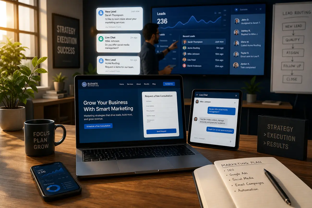
The visual should clarify the offer. A product screenshot, dashboard preview, sample report, consultation outcome, or before-and-after view is usually stronger than a generic stock image. Good landing page design helps visitors understand what they will receive before they have to read every word.
Build Trust Before You Ask for the Lead
People do not convert because a form exists; they convert because the perceived value is higher than the perceived risk. Use proof that matches the risk level. A low-friction lead magnet may only need a short testimonial or credibility badge. A high-consideration B2B service page may need case studies, client names, industries served, screenshots, security notes, and specific implementation details.
Specific proof is more persuasive than vague praise. “Reduced missed sales follow-ups by 38% in 60 days” is stronger than “Great service.” If you cannot use exact numbers, use concrete context: the customer type, the challenge, the process, and the outcome. Place proof near decision points, not only at the bottom of the page.
Address objections directly. Common concerns include price, time commitment, setup effort, data security, quality, and whether the offer is truly relevant. A short “What happens next?” section can reduce anxiety by explaining the process after submission. For lead-driven businesses, connecting forms to fast follow-up systems also matters; see this guide to website-to-CRM integration strategy for faster follow-up.
Use Landing Page Design to Create a Fast Lead Capture Path
Effective landing page design is not about decoration. It is about attention control. The visual hierarchy should make the headline, supporting copy, CTA, proof, and form easy to scan. Use contrast for buttons, generous spacing between sections, directional cues, and repeated CTAs after key proof points.
Remove distractions that do not support the campaign goal. For many landing pages, that means minimizing navigation, hiding footer clutter, and avoiding unrelated content. The form should match the funnel stage. Ask only for what you need now; a downloadable guide may require only name and email, while a quote request may justify budget, timeline, company size, or project details.
Mobile performance is essential. Make buttons large enough to tap, forms simple to complete, copy concise, and pages fast-loading. Accessibility also supports conversion: readable type, clear labels, strong contrast, and logical section order help more visitors take action. If mobile traffic is important, this guide on how to build a mobile-friendly website that drives growth is a useful next read.
Learn From High Converting Landing Page Examples
High converting landing page examples differ by conversion type, but the strategy is consistent. SaaS demo pages often use outcome-driven headlines, product screenshots, customer logos, and calendar-based CTAs. Lead magnet pages focus on the asset, the problem it solves, and a short form. Service consultation pages rely on trust, process clarity, and proof. Webinar pages emphasize topic urgency, speaker credibility, and date details. Ecommerce offer pages highlight savings, product benefits, reviews, and risk reversal.
What strong examples usually have in common is message match, specific proof, clear CTA copy, concise sections, and focused design. Copying a layout is less useful than copying the logic behind it: what must the visitor believe before they say yes?
For example, a weak version might say: “Improve Your Business. Submit the form to learn more.” The form asks for 10 fields, and the page has no proof. A stronger version says: “Find the 3 Lead Leaks Costing Your Service Business Sales Calls.” The CTA says “Get My Free 15-Minute Lead Audit,” the form asks for four essential fields, and a testimonial appears beside it. That is the anatomy of a high converting landing page in practice: specific promise, low friction, and timely proof.
Measure, Test, and Improve the Page After Launch
A landing page is not finished when it goes live. Track conversion rate, form completion rate, CTA clicks, scroll depth, traffic source performance, and lead quality. If many visitors click the CTA but abandon the form, the issue may be friction. If few visitors click, the issue may be motivation, offer clarity, or trust.
Prioritize tests based on the biggest likely constraint. Test the headline, offer framing, CTA copy, form length, proof placement, visual hierarchy, and page speed. Run tests long enough to avoid false conclusions from tiny sample sizes, and do not change too many variables at once unless you are deliberately testing a full page redesign.
Use qualitative inputs to find better ideas: sales call notes, chat logs, heatmaps, session recordings, survey responses, and form abandonment data. The best landing pages evolve with the campaign. Treat the page as a living conversion asset, not a one-time design project.
FAQ
What makes a landing page convert more leads?
A landing page converts more leads when it has a focused offer, strong message match, credible proof, a low-friction form, and one clear CTA. The page should quickly show visitors that they are in the right place, explain the value of the offer, reduce doubt, and make the next step easy.
What should be included in the anatomy of a high converting landing page?
The anatomy of a high converting landing page should include a clear hero promise, benefit-led copy, trust signals, objection handling, repeated CTA sections, and a simple lead capture form. For higher-commitment offers, add stronger proof such as case studies, customer logos, security information, or process details.
How is landing page design different from normal website design?
Landing page design is built around one campaign-specific action, while normal website design often supports many paths, audiences, and goals. A landing page removes distractions, limits exits, and guides visitors toward a single conversion.
Can I build a high-converting landing page with a free website builder?
Yes, a free website builder can work for simple campaigns, early validation, portfolio pages, and basic lead capture. However, free tools may limit branding, custom domains, speed, integrations, analytics, testing, or form functionality. For serious campaigns, those limitations can affect conversion and measurement.
What is the best free portfolio website maker?
The best free portfolio website maker depends on your goal. Wix, Google Sites, Canva, Carrd, Behance, and Adobe Portfolio-style tools can all work for basic portfolios. If the portfolio is also meant to generate leads, choose the option that gives you clear CTAs, fast mobile pages, form capture, and analytics.
What is the free website to put my portfolio on?
You can put a portfolio on free platforms such as Google Sites, Wix, Canva, Behance, GitHub Pages for technical portfolios, or a free WordPress.com site. For a business landing page, prioritize a custom domain, professional branding, and lead capture over simply choosing the cheapest option.
Is Google portfolio free?
Google does not offer a widely used product called “Google Portfolio” in the same way some website builders do, but Google Sites is free with a Google account and can be used to create a simple portfolio. You may still need to pay for a custom domain if you want a more professional URL.
Is Wix website builder really free?
Wix has a free plan, so you can build and publish a basic site without paying. For serious landing pages, you will usually want paid features such as a custom domain, removal of Wix ads, more storage or bandwidth, and stronger business tools. Wix pricing changes by plan and region, so check the current pricing page before deciding.
What is a disadvantage of using Wix for landing pages?
The main disadvantage of using Wix for landing pages is limited flexibility compared with dedicated landing page platforms or custom builds, especially for advanced A/B testing, performance optimization, integrations, and custom marketing workflows. It can still be a good option for simple pages and small teams.
Which website builder is better than Wix for landing pages?
The better choice depends on your needs. Webflow may suit teams that want design control, WordPress may suit content and SEO flexibility, Unbounce and Leadpages are built for landing page testing, and HubSpot can be strong when CRM integration is central. Choose based on conversion goals, not popularity.
Share Article
Your Digital Edge, Fully Automated
Spin up a cutting-edge website in minutes and preview it free - no signup, no credit card. Then keep growing it with MR.ROBOT's AI pipeline that writes, optimizes, and publishes SEO articles straight from your phone.
No signup. No credit card. You only pay when you love the result.