If you already buy traffic, the sales page vs landing page decision is not academic. It changes conversion rate, ad efficiency, and how fast a visitor understands the next step. Pick the wrong format and you force cold traffic to evaluate a full offer too early, or you send ready-to-buy traffic to a page that withholds the details they need. Good page strategy matches buyer temperature, traffic source, and the amount of proof required before a click becomes revenue.
Sales Page vs Landing Page: How to Choose the Right Page for Each Buying Stage
A sales page is built to persuade a warm visitor to commit. It gives the full case: problem, promise, proof, objections, pricing, and a clear CTA. A landing page is narrower. It focuses attention on one campaign-specific action such as claiming an offer, starting a trial, joining a list, or clicking through to a product detail page.
The best choice depends on funnel stage. For an ad click from cold traffic, a landing page usually wins because it keeps message match tight and limits distraction. For email traffic from engaged subscribers, a sales page can work because the visitor already has context. For bottom-of-funnel traffic with strong purchase intent, a sales page often converts better because it answers the last few questions blocking purchase. In a sales page vs landing page choice, friction usually comes from mismatch: too much detail for cold traffic, or not enough detail for ready buyers.
That mismatch shows up fast in performance. Relevance drops, bounce rate rises, and conversion weakens because the page asks for a decision the visitor is not ready to make. The page type should fit the temperature of the click, not your internal preference for short or long copy.
How Sales Pages Increase Conversion Rate by Removing Buying Hesitation
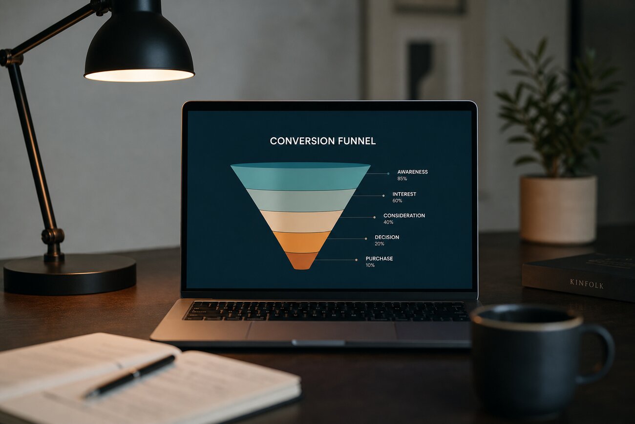
High-converting sales pages do one job well: they remove hesitation in the order buyers actually feel it. The common sequence is simple: define the problem, agitate the cost of inaction, present the solution, explain the offer, prove it works, handle objections, and ask for the sale. That structure is not cosmetic. It mirrors how people justify a purchase to themselves.
This is why long-form messaging can outperform shorter pages for higher-ticket offers, complex products, premium bundles, coaching, supplements, or B2B software. A $19 impulse purchase may need a strong hero and a clean CTA. A $299 product or annual software plan needs more. Visitors want specifics on outcomes, what's included, who it is for, and why your option beats the alternatives.
The highest-leverage blocks are usually proof and clarity. Put testimonials near the claim they support. Make guarantees specific, not vague. Use FAQs to answer shipping, setup, returns, timeline, and fit. Show pricing without forcing people to hunt for it. When intent exists, these elements turn interest into paid orders.
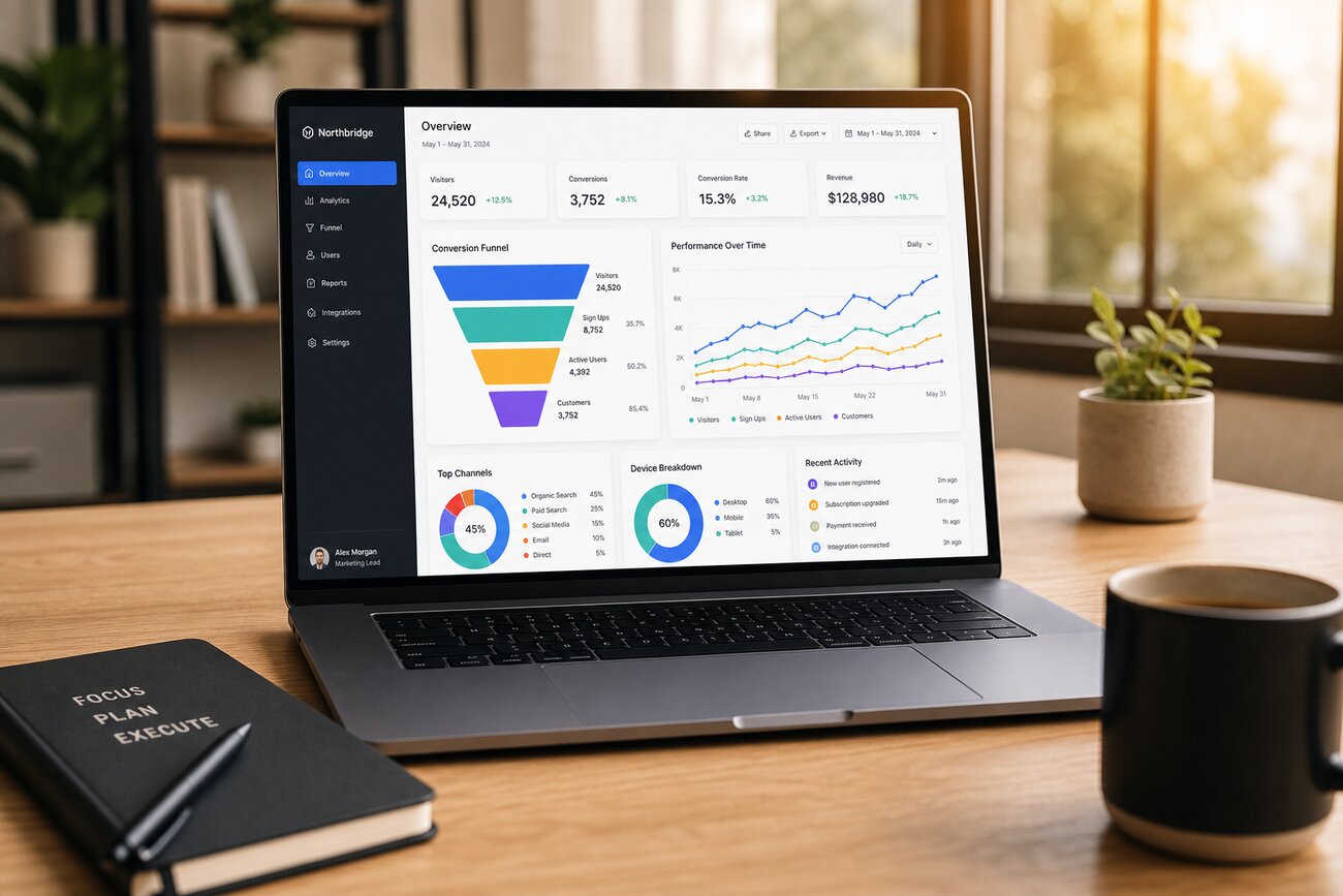
What eCommerce Conversion Rate Optimization Means on Landing Pages
Conversion rate optimization means increasing the percentage of visitors who take a desired action. On landing pages, that action might be an email submit, add to cart, quiz start, free trial, or click-through to a product page. CRO is not a design trend. It is the discipline of finding where users hesitate, then reducing that hesitation.
On landing pages, the biggest gains usually come from message match, fewer distractions, faster load time, and clearer next steps. If the ad promises a discount for first-time buyers, the headline should confirm that promise immediately. If the page has five competing links, the visitor has five easy ways to leave the intended path. If mobile takes four seconds to render the hero, attention is gone before your copy gets a chance.
Button color matters far less than the full decision path. A visitor asks: Am I in the right place? Is this offer relevant? Can I trust it? What happens next? Good CRO improves those answers from top to bottom.
How to Improve eCommerce Conversion With Landing Page Tactics That Reduce Friction
Start with changes that improve understanding before you chase micro-optimizations. Tight headline-to-ad alignment, one obvious CTA, mobile-first layouts, faster load times, and shorter forms solve more problems than clever copy experiments. The visitor should know the offer, the benefit, and the next click without scrolling far.
- Align the hero with the click source: repeat the core promise from the ad or email in the headline.
- Use one primary CTA: every extra path weakens attention.
- Write benefit-led copy: lead with the result, then explain the feature.
- Place proof near action: reviews, usage numbers, and media mentions work best close to the CTA.
- Reduce checkout anxiety: show shipping speed, return policy, and payment options early.
- Shorten forms: ask only for what the next step requires.
Test high-impact variables first: hero section, offer framing, checkout path, and CTA copy. Those elements change the economics of a page. Swapping icon styles rarely does.
Product Landing Page Examples That Convert by Matching Intent, Offer, and Proof
The best product landing page examples do not look identical, because they serve different traffic sources and buying contexts. What they share is tighter alignment between intent, offer, and proof. They make the first screen answer the visitor's main question, then use page structure to build confidence without slowing momentum.
- Single-product direct-response: ideal for paid social to a hero product. It leads with one benefit, one SKU focus, one CTA, and fast proof such as star ratings, before-and-after outcomes, or creator endorsements.
- Collection promo: useful when the click is category-driven, like “summer essentials” or “gifts under $50.” The page frames the promo clearly, segments choices, and keeps browsing controlled instead of chaotic.
- Feature-led SaaS product page: effective for high-intent search or retargeting. It turns product capabilities into business outcomes, then supports each claim with proof, integrations, and a low-friction demo or trial CTA.
When reviewing product landing page examples, borrow structure rather than visual style. Ask why the page works for that click. Did it reduce choice? Increase clarity? Add proof at the right moment? The most useful product landing page examples teach sequencing: promise first, evidence second, action third.
Why a Presell Page Can Be the Missing Conversion Bridge Between Click and Checkout
A presell page sits between the click and the main sales or product page. Its job is to warm up traffic before asking for a stronger commitment. That makes it useful for cold paid traffic, complex products, skeptical audiences, and crowded categories where the visitor needs context before comparing options. Instead of forcing an immediate purchase decision, the page reframes the problem and makes the next click feel earned.
A good presell page is not a slower version of a landing page. It is a qualifying asset. It educates, filters weak clicks, and raises the intent of people who continue. The simplest flow works well in most markets:
- Hook: restate the pain point or desired outcome from the ad.
- Problem: explain why common solutions disappoint.
- Credibility: add proof, expertise, or relevant data.
- Solution framing: show the mechanism or category angle.
- Click-through CTA: send qualified users to the main page with clear expectation.
If your traffic is curious but not convinced, a presell page can improve downstream conversion by doing the education work before checkout pressure starts.
Share Article
Your Digital Edge, Fully Automated
Spin up a cutting-edge website in minutes and preview it free — no signup, no credit card. Then keep growing it with Mr. Robot's AI pipeline that writes, optimizes, and publishes SEO articles straight from your phone.
No signup. No credit card. You only pay when you love the result.