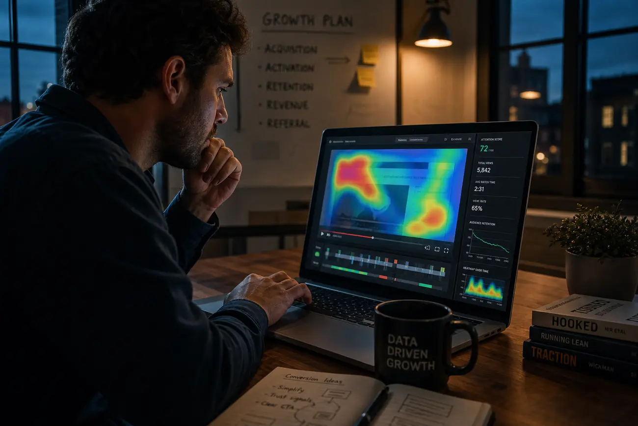
A heat map in data visualization can reveal why traffic looks healthy but enquiries, sales, or bookings stay flat: the real problems are often hidden in how visitors behave on the page. By combining heatmaps, session recordings, and funnel data, SMEs can stop guessing and identify where users hesitate, get distracted, miss calls to action, or abandon the conversion path.
What a Heat Map in Data Visualization Reveals About Conversion Problems
A heat map in data visualization is a visual layer that shows patterns of user behavior on a webpage. Depending on the tool, it can show where people click, how far they scroll, where they move their cursor, or which parts of the page attract the most attention. Instead of reading rows of analytics data, you see behavior as color intensity: hotter areas usually mean more activity.
For SMEs, this is useful because conversion problems are rarely obvious. A page may look professional but still hide the offer below the fold, distract users with secondary links, or make the form feel risky. Heatmaps help answer practical questions: are visitors seeing the value proposition, clicking the right CTA, ignoring the form, or getting stuck before they reach the next step?
The limit is important: a heat map in data visualization shows patterns, not motivations. It can show that users are clicking a non-clickable image, but not always why. That is why heatmaps work best alongside session recordings, analytics, user feedback, and funnel data visualization.
The Main Types of Heatmap Graphs and When to Use Each One
Each heatmap graph answers a different conversion question. Reviewing the right type prevents you from drawing the wrong conclusion from attractive visuals.
- Click maps: show where visitors click or tap, helping you spot ignored CTAs, confusing buttons, false affordances, and distracting page elements.
- Scroll maps: reveal how far people move down the page, which helps you decide whether proof, pricing, forms, or key benefits are too low.
- Move or attention maps: show cursor movement on desktop and can suggest reading behavior or areas of interest.
- Segmented heatmap graph analysis: compares groups such as new versus returning visitors, mobile versus desktop, paid versus organic traffic, or converters versus non-converters.
Always review mobile and desktop separately. A CTA that is obvious on desktop may be buried on mobile, and mobile users often scan, tap, and abandon differently from desktop users.
How Session Recordings Add the Missing Context Behind Heatmaps
Session recordings are anonymized replays of visitor journeys. They show scrolling, clicking, hesitation, rage clicks, form errors, backtracking, and navigation loops. If a heatmap graph tells you that few users click a CTA, recordings help you understand whether the CTA is invisible, unclear, distrusted, or blocked by technical friction.
Useful red flags include repeated clicks on non-clickable items, rapid scrolling past key content, abandoned forms, long pauses near pricing, users returning to the same menu several times, and clicks that do not produce the expected result. These moments often reveal practical conversion problems faster than a dashboard alone.
Do not watch recordings randomly. Filter by high-intent pages, cart abandonment, lead form drop-offs, paid campaign traffic, or users who reached pricing but did not convert. Also protect privacy: mask personal data, avoid recording sensitive fields, and follow consent, cookie, and compliance requirements in your market.
Use Funnel Data Visualization to Find Where to Investigate First
Funnel data visualization is the bridge between analytics and behavioral tools. It shows where users drop off in the journey, while a heat map in data visualization helps explain what happens on a specific page. Start by mapping the path: landing page, product or service page, CTA click, form start, form completion, checkout, confirmation, or thank-you page.
Prioritize pages with commercial impact: high traffic plus high drop-off, paid traffic landing pages, checkout pages, lead forms, pricing pages, and key service pages. For example, if your funnel shows many users reach the form but few complete it, review scroll maps, click maps, and recordings for that form before redesigning the whole website. For more on judging page performance, see Is Your Landing Page Working? Metrics That Tell the Truth.
Where CRM questions fit into conversion analysis
CRM data matters after the visitor becomes a lead. CRM software is a system for managing customer relationships, sales activity, follow-ups, and lead status. Examples of CRM software include Salesforce, HubSpot, Zoho CRM, Pipedrive, and Microsoft Dynamics 365. Excel can track contacts, but it is not a true CRM because it lacks automated pipelines, activity history, permissions, and integrations. The four common CRM types are operational, analytical, collaborative, and strategic CRM. The “top 3” or “#1 CRM platform” depends on business needs, though Salesforce, HubSpot, and Microsoft Dynamics 365 are frequently shortlisted. If you want to connect ad spend, leads, and closed revenue, this guide on tracking real conversions across Google Ads, Meta Ads, and CRM is a natural next step.
A Practical SME Workflow for Finding Website Conversion Problems
Use a focused workflow rather than exploring every heatmap until something looks interesting. The goal is to connect behavioral evidence to one business outcome.
- Step 1: choose one conversion goal, such as enquiry form submissions, demo bookings, purchases, quote requests, or newsletter signups.
- Step 2: install heatmap and recording tools on the most important pages and collect enough data before deciding.
- Step 3: review heatmaps by device and traffic source to find visibility, engagement, and click issues.
- Step 4: watch a focused sample of recordings from users who abandoned key steps.
- Step 5: group findings into themes: unclear value proposition, weak CTA, confusing layout, trust concerns, form friction, pricing anxiety, or bugs.
- Step 6: turn observations into testable hypotheses, such as moving the CTA higher, simplifying the form, clarifying pricing, or adding trust proof near hesitation points.
A strong hypothesis links evidence to an expected result: “Mobile users are not seeing the quote button before scrolling, so moving it above the fold should increase quote starts.” That is more useful than “make the page better.”
How to Turn Behavioral Insights Into Prioritized Conversion Fixes
After reviewing a heat map in data visualization and relevant recordings, prioritize fixes with an impact-effort matrix. High-impact, low-effort improvements should move to the top of the backlog, especially when they affect high-intent users, high-value pages, or large traffic segments.
- Fix immediately: broken buttons, unreadable mobile layouts, form validation errors, slow-loading checkout steps, or CTAs hidden by layout issues.
- Test where possible: CTA wording, pricing presentation, page layout, offer framing, trust badges, testimonials, and form length.
- Document each issue: evidence, affected segment, suspected cause, proposed fix, and success metric.
Common fixes include moving CTAs higher, removing distracting links, making clickable elements visually obvious, shortening forms, adding reassurance copy near pricing, improving page speed, and clarifying what happens after submission.
Common Mistakes When Interpreting Heatmaps and Recordings
More clicks do not always mean more interest. They may indicate confusion, frustration, or a user trying to interact with something that is not actually clickable. Likewise, a dramatic session recording can be memorable without being representative.
- Do not combine mobile and desktop behavior into one conclusion.
- Do not make major design changes from too little data.
- Do not treat heatmaps as a replacement for analytics, user research, or A/B testing.
- Do not optimize low-impact pages first just because their heatmaps look interesting.
Also avoid confusing website behavior tools with unrelated graphing software. Vernier Graphical Analysis is an educational app used to collect, graph, and analyze sensor data in science learning; it is not a website heatmap tool. It is generally safe when downloaded from official sources and used according to its privacy terms, but organizations should still check their own compliance requirements.
FAQ
What is a heat map in data visualization?
A heat map in data visualization is a color-coded representation of data intensity or user behavior. On websites, it commonly shows where visitors click, scroll, move, or focus so patterns are easier to spot quickly.
What is a heatmap graph used for on a website?
A heatmap graph helps identify whether visitors notice important content, click the intended calls to action, ignore key sections, hesitate near forms, or interact with elements that look clickable but are not.
How do session recordings help improve conversions?
Session recordings show the sequence and context behind user actions. They make it easier to diagnose friction such as rage clicks, form errors, confusing navigation, pricing hesitation, or users repeatedly moving between the same pages.
How is funnel data visualization different from a heatmap?
Funnel data visualization shows where users drop off across a journey, such as from landing page to form completion. Heatmaps explain behavior on individual pages, such as whether users saw the CTA or scrolled past the offer.
How many session recordings should an SME review?
Review a focused sample rather than watching randomly. Start with recordings from important pages, specific devices, traffic sources, and drop-off points, then continue until the same friction patterns repeat.
What should I fix first after reviewing heatmaps and recordings?
Fix issues tied directly to a conversion goal on high-value pages first, especially if they affect many users or high-intent traffic. Broken elements and form errors should be fixed immediately; larger copy or layout changes should usually be tested.
Share Article
Your Digital Edge, Fully Automated
Spin up a cutting-edge website in minutes and preview it free - no signup, no credit card. Then keep growing it with MR.ROBOT's AI pipeline that writes, optimizes, and publishes SEO articles straight from your phone.
No signup. No credit card. You only pay when you love the result.