If you want more revenue from the same traffic, start by fixing what happens after the click. The fastest gains usually come from better diagnosis, sharper messaging, and less friction at key steps, not bigger budgets. Good website conversion optimization tools help you spot where users hesitate, abandon, or get confused so you can make smarter changes instead of guessing. Your job is simple: find the biggest leaks, fix the clearest blockers, and measure whether more visitors complete the action you want.
Which website conversion optimization tools actually move the needle?
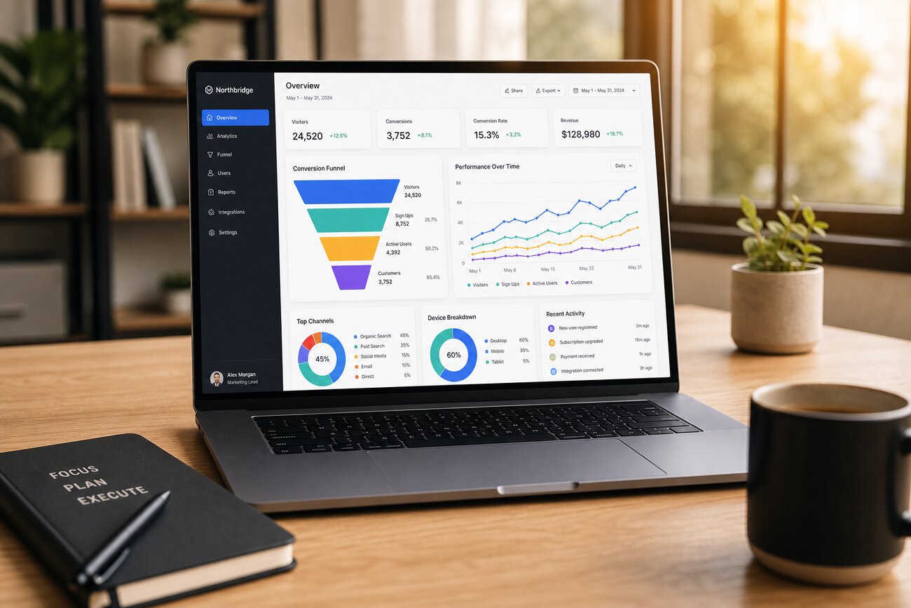
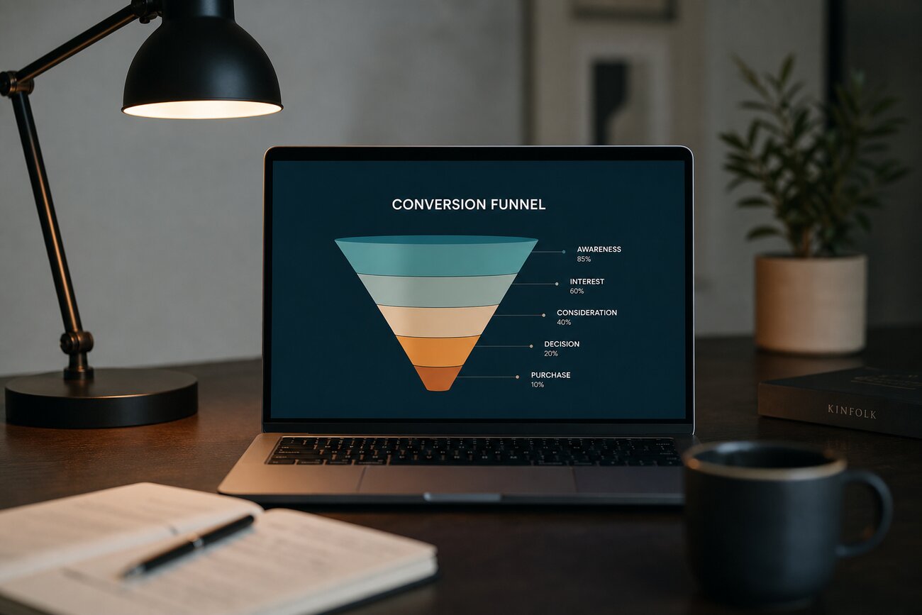
The most useful website conversion optimization tools fall into three buckets: analytics, heatmaps/session recordings, and A/B testing. Analytics tools tell you where the drop happens: product page to cart, cart to checkout, form start to form submit. Heatmaps and recordings tell you why: rage clicks on non-clickable elements, scroll drop-off before key proof points, repeated field corrections, or users hovering around shipping information. A/B testing tools help you validate whether a change actually improves performance.
Use each tool for a different job. Analytics is for prioritization. Heatmaps and recordings are for friction discovery. A/B testing is for decision-making. If you mix those roles up, you end up watching recordings for pages that barely get traffic or testing cosmetic tweaks without understanding the problem first.
The key point: tools diagnose, they do not fix. A heatmap will not solve weak copy. A funnel report will not remove checkout anxiety. A test platform will not write a better offer. What moves the needle is the action you take after the data shows a pattern. Start by reviewing these signals weekly:
- Rage clicks: users expect something to work, but it does not.
- Scroll drop-off: important proof or CTA sits too low on the page.
- Abandoned forms: too many fields, unclear labels, or unnecessary effort.
- Dead clicks and backtracks: users cannot find the next step.
Where are most conversions leaking out of your funnel right now?
Most leaks happen on high-intent pages: product detail pages, cart, checkout, and lead forms. On product pages, visitors often lose momentum when pricing is unclear, shipping is hidden, or the product page does not answer obvious objections. In checkout, friction shows up as coupon hunting, forced account creation, surprise fees, or slow mobile input. In lead gen funnels, the leak is usually effort: too many fields, unclear value, or a weak thank-you path.
Look for behavioral signals of intent breakdown. These include a strong click-through from ads but low add-to-cart rate, high add-to-cart but low checkout start, checkout starts with poor completion, or users spending time on pricing and FAQ sections without converting. Those are not random numbers. They usually point to a specific question the page is failing to answer.
Audit by traffic volume first, not by opinion. If one page gets 40% of your paid traffic, that is where you focus. A 1% lift on a high-traffic page matters more than a 20% lift on a page almost nobody sees. Pull your top landing pages, top exit pages, and biggest form drop-off steps, then rank them by traffic and business value. That gives you a practical list of leaks to fix first.
How do you handle landing page conversion rate optimization without redesigning the page?
The easiest wins in landing page conversion rate optimization usually come from message match, not visual overhaul. If the ad promises “Free 2-Day Shipping,” the headline, hero copy, and CTA should reinforce that promise immediately. If the keyword or audience intent is problem-aware, the page should lead with the problem and solution, not generic brand language. Visitors should feel they landed in the right place within seconds.
Before asking for a redesign, tighten what is already there. Rewrite the headline to be more specific. Cut form fields that do not directly help sales. Change CTA copy from vague text like “Submit” to something tied to value, like “Get My Quote” or “See Available Plans.” Move reviews, star ratings, guarantees, or customer logos higher on the page so users do not have to hunt for reassurance.
That is the core of landing page conversion rate optimization: improve clarity before aesthetics. A cleaner hierarchy, clearer benefit statement, and stronger proof often beat a full redesign because they reduce confusion without slowing the team down. If you can explain the offer faster and ask for less effort, conversions usually follow.
What quick fixes increase website conversion rate the most?
If you need fast wins that increase website conversion rate, start with speed, navigation, and CTA clarity. Slow pages kill momentum, especially on mobile and paid traffic. Compress heavy media, remove scripts you do not need, and test key pages on real mobile devices. Next, simplify navigation on conversion-focused pages. Too many menu options create escape routes. Finally, make CTAs more specific. “Buy Now,” “Start Free Trial,” or “Book My Demo” generally outperform vague labels because they reduce hesitation.
Trust builders also pay off quickly. Add product reviews near the CTA, show return and shipping policies before checkout, and surface guarantees where risk feels highest. Security badges matter less than many marketers think, but proof of real customers, predictable policies, and transparent pricing matter a lot. People convert when they trust both the product and the process.
Do not ignore mobile-specific friction. Common fixes include:
- Shorter forms with the right input types for phone keyboards
- Sticky CTAs on long product pages
- Popups that do not block the main action
- Layouts that keep price, proof, and CTA visible without excessive scrolling
These are often the fastest ways to increase website conversion rate because they remove friction users feel immediately.
How can you reduce friction and anxiety right before the conversion step?
Right before conversion, most resistance comes from four things: uncertainty, effort, risk, and weak urgency. Users hesitate because they are not sure what happens next, how long it will take, whether they can trust the outcome, or whether now is the right time to act. Your page should answer those questions before users have to ask them.
Make objections easy to resolve. Add short FAQs near the CTA. Clarify shipping windows, returns, pricing terms, trial details, cancellation rules, and what happens after form submission. If you sell a complex offer, show a simple three-step “how it works” explanation. If price is a sticking point, explain value or financing clearly instead of forcing users to dig.
Reduce decisions wherever possible. If a form only needs five fields, do not ask for nine. If one CTA matters most, stop competing with it. If there are multiple packages, highlight a recommended option. Fewer choices and clearer next steps reduce cognitive load, which increases follow-through.
What should you test first if you want to increase website conversion rate without more ad spend?
Test on pages with both high traffic and high intent. That usually means your main paid landing pages, best-selling product pages, cart, checkout, and top lead forms. Start with elements closest to user motivation: offer, headline, CTA, form length, and proof. These tend to outperform cosmetic tests because they change how people understand value and effort.
A good test order looks like this:
- Offer: pricing, bundle, trial, shipping, guarantee
- Headline and subhead: tighter message match and clearer benefit
- CTA: stronger wording, better placement, fewer distractions
- Form length: remove fields and reduce completion effort
- Proof: reviews, results, client logos, guarantees placed earlier
If your goal is to increase website conversion rate without spending more on ads, use a simple framework: find, fix, measure, repeat. Find the leak with analytics and behavior tools. Fix the biggest friction point with the smallest meaningful change. Measure the result against a clear conversion metric. Then repeat on the next highest-impact page. That cycle is how steady conversion gains compound into real revenue growth.
Share Article
Your Digital Edge, Fully Automated
Spin up a cutting-edge website in minutes and preview it free — no signup, no credit card. Then keep growing it with Mr. Robot's AI pipeline that writes, optimizes, and publishes SEO articles straight from your phone.
No signup. No credit card. You only pay when you love the result.