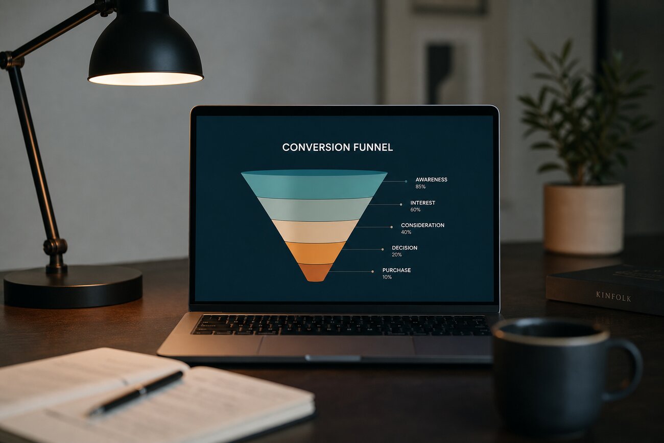
If paid campaigns keep filling the top of the funnel while revenue barely moves, ecommerce conversion optimization is the missing lens. The job is not to chase more sessions; it is to remove friction between purchase intent and completed order. Teams asking how to convert website visitors into customers often already have enough traffic. What they lack is a clear read on where qualified shoppers hesitate, lose confidence, or simply fail to find the shortest path to buy.
Sign #1: Strong traffic, weak sales—why ecommerce conversion optimization starts with the gap between sessions and revenue
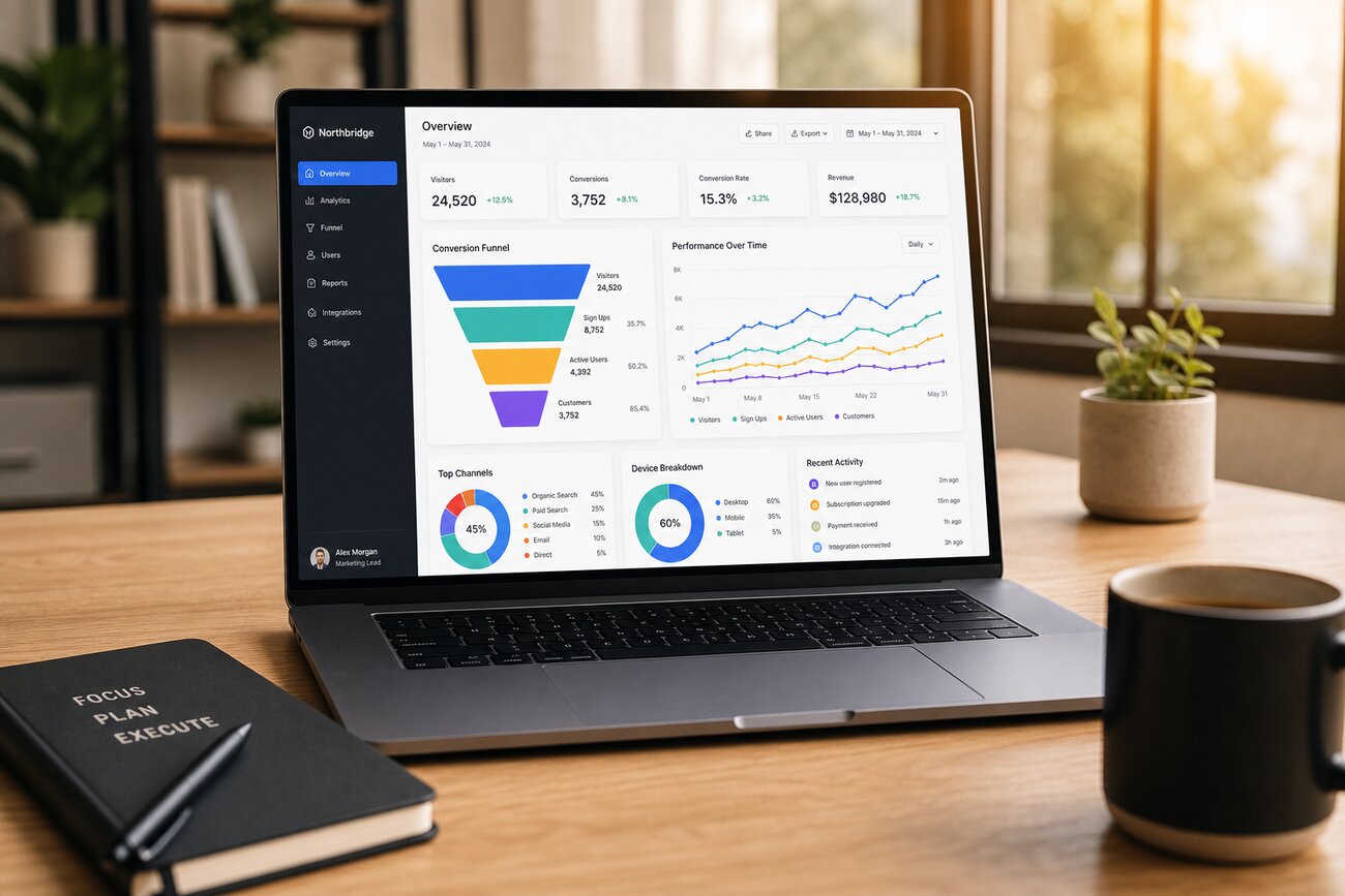
Ecommerce conversion rate optimization is the practice of removing friction between intent and purchase. The clearest symptom is simple: sessions are rising, yet revenue per visitor stays flat or slips. That pattern usually points to mid-funnel leakage, not an acquisition problem. You paid to bring in qualified interest, but the site is failing to turn that interest into action.
Benchmarks can help frame whether performance is weak, but they rarely explain why. A store converting at 2% may be healthy in one category and underperforming in another. The useful view is segmented behavior by channel, device, landing page, new versus returning visitor, and product margin tier. That is where ecommerce website optimization stops being abstract and starts becoming diagnostic.
- Bounce rate by source and landing-page segment
- Scroll-depth on key pages
- Add-to-cart rate by category and PDP
- Checkout exit rate by step
When those metrics move in opposite directions, the leak is visible. A healthy click-through to product pages with weak add-to-cart suggests merchandising friction. Strong cart starts with sharp checkout exits suggests process friction. The fix direction is to prioritize the largest revenue gap first, not the loudest opinion in the room.
Sign #2: High-intent landing pages bounce before shoppers even understand the offer
Branded and paid traffic should be your easiest audience to orient. When those landing pages bounce above the fold, the problem often appears in user testing within seconds: shoppers pause at the hero, reread the headline, and still cannot answer what is being sold, why it matters, or what to do next. Session recordings usually show quick scrolls, back-button behavior, or dead clicks on noninteractive elements.
The common culprits are predictable: slow load times, cluttered headlines, weak value proposition, and competing calls to action. If the first screen asks visitors to choose between five paths before establishing relevance, hesitation is rational. For teams focused on how to convert website visitors into customers, the right fix direction is not more persuasion lower down the page. It is a sharper first screen, clearer message match to the ad, and mobile speed tested under real network conditions.
Sign #3: Category pages get traffic, but shoppers cannot find a path to the right product
Category pages often absorb a large share of nonbrand traffic, yet many stores under-measure what happens next. If category visits are healthy but product-detail progression is low, shoppers are telling you the assortment is hard to navigate. Another giveaway is exits after sorting or rapid filter toggling without any downstream PDP views. In testing, users will say “there are too many options” or “I do not know which filter matters.”
This is where ecommerce website optimization becomes operational. Poor taxonomy, inconsistent product naming, weak on-site search, and confusing faceted filtering create friction before a product is ever considered. The fix direction is cleaner hierarchy, filters that reflect real buying criteria, and search results that respect intent rather than keyword literalism.
Sign #4: Product pages earn attention, but adds to cart stay stubbornly low
A healthy PDP scroll depth paired with a weak add-to-cart rate is one of the clearest signs of silent revenue loss. Shoppers are looking; they are just not convinced. Heatmaps often show repeated attention on shipping, returns, reviews, sizing, and payment options. That behavior signals unanswered risk, not lack of interest.
The usual causes are weak trust cues, hidden shipping information, buried calls to action, and merchandising that forces users to hunt for the real reason to buy. This is the quiet answer to the question many teams ask: how to improve eCommerce conversion? Start by making reassurance impossible to miss. Reviews, delivery expectations, return terms, stock clarity, and the primary CTA should sit where intent peaks, not where design leaves room for them. Stronger merchandising basics do more than another promotional banner.
Sign #5: Checkout starts are solid, then form abandonment spikes at the worst possible moment
When checkout starts look healthy but orders do not follow, inspect the step-level drop-off. The worst leaks usually cluster around forced account creation, address entry, and payment. Field-error rates tell the story fast: if users repeatedly trigger validation messages, re-enter postcodes, or abandon at payment selection, the form is asking for more effort than the purchase feels worth.
Coupon code boxes also create outsized distraction. Session recordings routinely show shoppers leaving checkout to search for discounts they were never promised. Add unexpected shipping or tax late in the process, and abandonment climbs further. The fix direction is to reduce steps, cut unnecessary fields, make error handling clearer, and surface total cost earlier so the last mile does not become the breaking point.
Sign #6: Mobile drives the visits, but desktop still captures most of the revenue
Many teams accept this gap as normal, but the size of the gap matters. If mobile drives most sessions yet contributes a disproportionately small share of revenue, the site is likely difficult to use under real thumb-and-scroll conditions. Analytics will usually show shorter sessions, lower product-view depth, weaker add-to-cart rates, and heavier checkout abandonment on mobile than desktop.
This is a classic ecommerce website optimization issue, not just a design preference. Core Web Vitals, intrusive pop-ups, sticky elements that cover content, and cramped form fields all suppress mobile conversion. Device-level segmentation is essential because aggregate averages hide the damage. The fix direction is thumb-friendly navigation, faster page rendering, cleaner forms, and QA on actual devices rather than resized desktop browser windows.
Sign #7: Returning visitors keep coming back, but high-value leads still will not commit
Repeat PDP views, saved carts, and multiple visits from the same users should feel promising. When they do not turn into purchases, the issue is often unresolved trust or risk. These shoppers are not unaware; they are unconvinced. They may be comparing prices, questioning quality, doubting delivery reliability, or waiting for reassurance that never becomes explicit.
Look closely at revisit touchpoints: email click-throughs, cart-return sessions, wishlist behavior, and branded search landings. If those users keep circling without buying, the site is failing to close perceived risk. The fix direction is better reassurance where they re-enter: clearer guarantees, stronger proof, firmer delivery messaging, and reminders that answer the last objection instead of repeating the first pitch.
Seven warning signs, one expensive pattern: friction is blocking how to convert website visitors into customers
These signs look different in analytics, but they point to one expensive pattern: qualified demand is reaching the site and then encountering avoidable friction. Some leaks happen above the fold, some in navigation, some on product pages, and some in checkout. The right priority is not the page with the most internal debate; it is the bottleneck with the clearest revenue impact.
For teams serious about how to convert website visitors into customers, the takeaway is blunt: every point of friction taxes acquisition spend. Better ads cannot compensate for a funnel that confuses, slows, or worries shoppers at the moment intent is strongest. Ecommerce conversion optimization and disciplined ecommerce website optimization are not finishing touches. They are how paid traffic becomes profit.
Share Article
Your Digital Edge, Fully Automated
Spin up a cutting-edge website in minutes and preview it free — no signup, no credit card. Then keep growing it with Mr. Robot's AI pipeline that writes, optimizes, and publishes SEO articles straight from your phone.
No signup. No credit card. You only pay when you love the result.