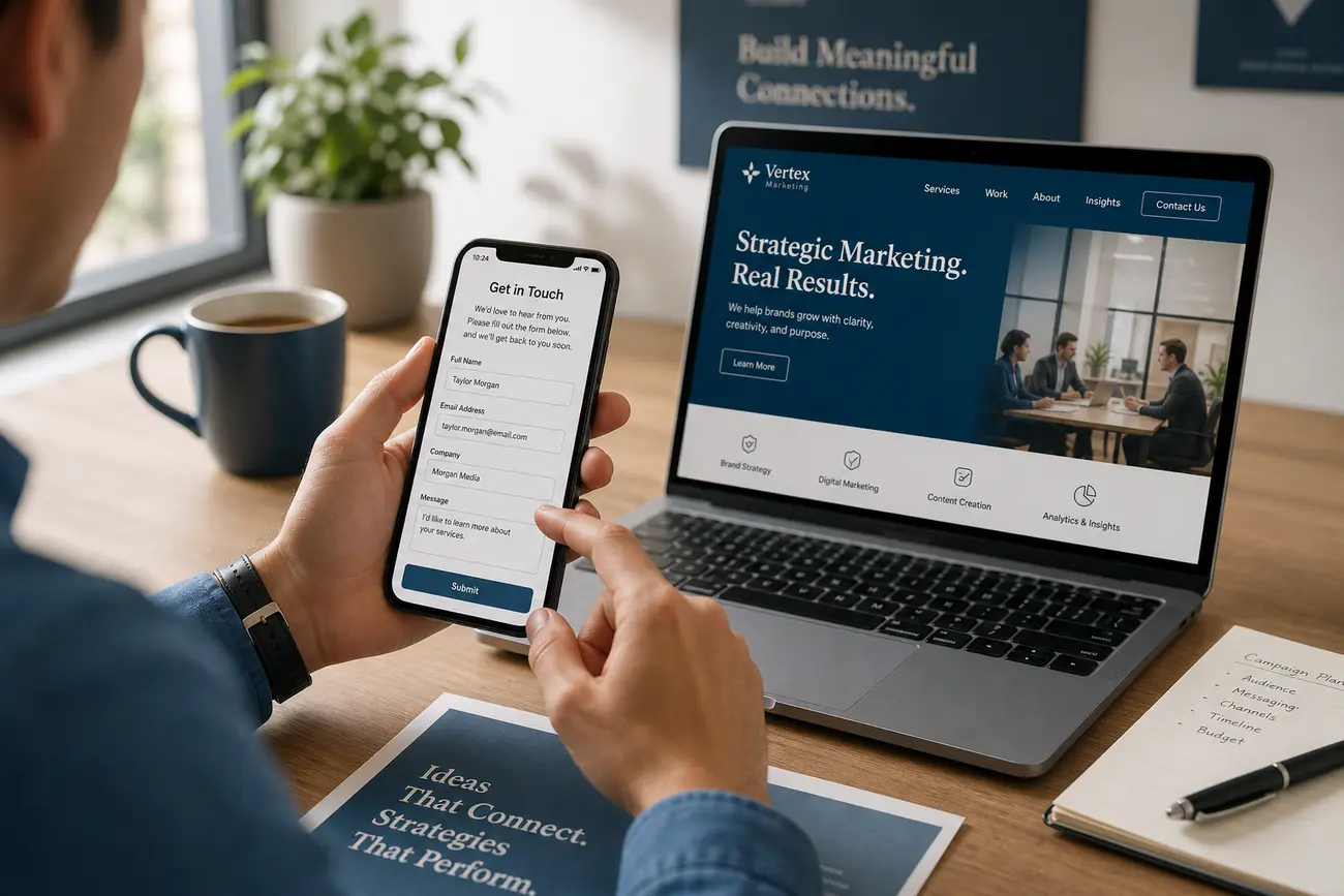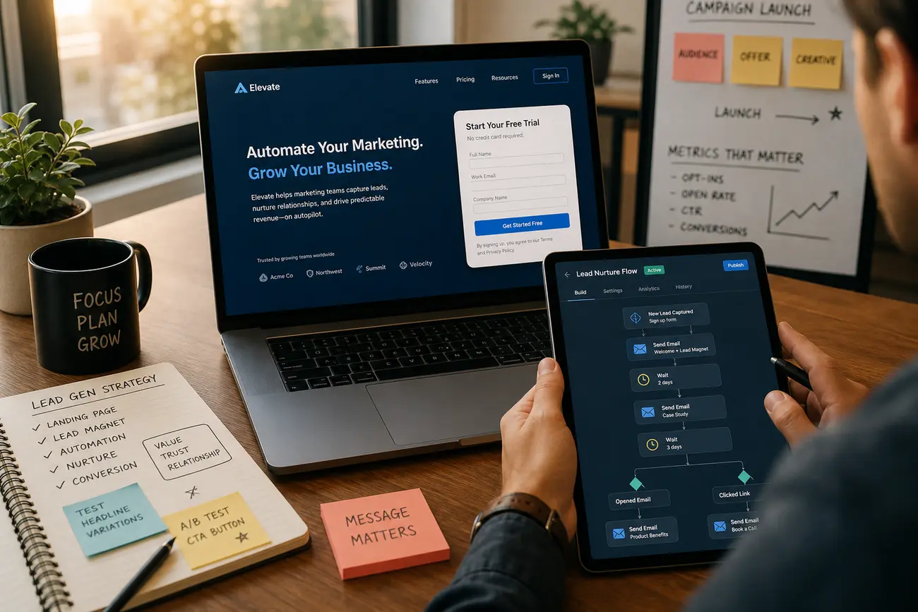
A high converting landing page is not just a polished web page; it is a complete lead-generation system built to turn focused attention into a measurable action. In this guide, you will learn how to shape the offer, structure the page, reduce friction, build trust, and follow up in a way that converts more of the right leads.
The best landing pages combine strategy, copy, landing page design, tracking, and sales process. If any one of those pieces is weak, the page may still get clicks, but it will struggle to create qualified enquiries, booked calls, demo requests, or revenue.
What Makes a High Converting Landing Page Work
A high converting landing page starts with one clearly defined conversion goal. That goal might be an enquiry, demo request, quote request, consultation booking, webinar registration, or lead magnet download. The page should be judged against that goal, not against vague metrics like “engagement” alone.
The strongest pages focus on one audience, one offer, and one primary action. When a visitor arrives from an ad, search result, email, or referral, the message on the page must match the promise that brought them there. This is known as message match, and it reduces the mental work required to decide whether they are in the right place.
It is also useful to distinguish a landing page from a starting page. A starting page is simply the default page a browser opens when launched; you set it in your browser settings. A conversion-focused landing page is different: it is intentionally built for a campaign, audience, and next step.
Start With the Offer Before You Touch Landing Page Design
Before working on landing page design, define what your visitor actually wants. What pain point are they trying to solve? What result do they want? How urgent is the problem? Are they researching, comparing vendors, or ready to speak with sales?
A weak offer forces copy and design to work harder than they should. “Contact us” is rarely as compelling as “Get a 15-minute growth audit” or “Request a same-day installation quote.” Strong offers are specific, outcome-led, and easy to understand. A practical value proposition can follow this formula: for this audience, with this problem, we help achieve this outcome, backed by this proof, with this next step.
Good conversion hooks include free assessments, audits, calculators, strategy calls, consultations, demos, quote requests, comparison guides, and lead magnets. If your offer is educational rather than sales-led, this guide on how to create a lead magnet that attracts qualified leads can help you choose a more compelling reason for visitors to opt in.
Build a Page Structure That Turns Attention Into Action
A high converting landing page usually follows a simple but deliberate structure. Above the fold, include a clear headline, a supporting subheadline, benefit-led bullets, one primary CTA, a relevant visual cue, and a proof element such as a testimonial, rating, logo, or result.
Your headline should mirror the ad, search query, or referral promise that generated the visit. If someone clicked an ad for “commercial solar quotes,” the page should not open with a generic company slogan. It should confirm that the visitor can get the relevant quote, understand the benefit, and know what happens next.
A proven page flow often looks like this:
- Problem: show that you understand the visitor’s pain or opportunity.
- Solution: explain the offer and why it solves the problem.
- Benefits: translate features into business or personal outcomes.
- Proof: add testimonials, results, logos, reviews, or credentials.
- Process: explain the steps after submission.
- Objection handling: address price, timing, risk, privacy, or complexity.
- CTA and form: make the next action obvious and low-friction.
Keep navigation minimal. Every unnecessary menu item, external link, or competing CTA gives visitors another way to leave the conversion path. Repeat your primary CTA at natural decision points, especially after benefits, proof, and objection-handling sections.
Use Proof, Trust Signals, and High Converting Landing Page Examples Strategically
Proof works best when it answers a doubt the visitor already has. Instead of using vague testimonials like “Great service,” choose testimonials that mention measurable outcomes, specific problems, buyer roles, industries, or decision criteria. A quote from “Operations Director, 120-person manufacturing firm” is usually more persuasive than an anonymous compliment.
Other trust signals can include case study snapshots, before-and-after metrics, client logos, third-party ratings, certifications, guarantees, compliance badges, payment security notes, or response-time promises. Place proof near moments of doubt: beside the form, near pricing-related copy, or immediately after a bold claim.
When studying high converting landing page examples, do not simply copy the layout. Look for the underlying strategy: a clear offer, strong message match, simple page flow, visible CTA, credible proof, and a form that fits the level of commitment. The best high converting landing page examples work because their traffic source, audience, and offer are aligned.
Design Forms and CTAs for Qualified Leads, Not Just More Submissions
Your form should match the value of the offer and the seriousness of the buying decision. A simple checklist download might only need a name and email. A high-value quote request may justify fields for budget, location, timeline, company size, or service need.
Ask only for information required to qualify, route, or personalize follow-up. Every extra field adds friction, but removing too many fields can flood your team with poor-fit leads. If lead quality matters, use progressive qualification options such as budget range, urgency, project type, or number of employees.
CTA copy should describe the outcome, not the mechanics. “Get My Free Audit,” “Book My Consultation,” or “Request a Quote” is clearer than “Submit.” Add microcopy near the form to reduce anxiety: response time, privacy reassurance, and what happens after the click. For a deeper look at this topic, read how to reduce lead form abandonment and capture better enquiries.
Track, Test, and Improve Conversion Performance
You cannot improve what you cannot measure. Set up tracking for form submissions, calls, booking completions, CTA clicks, scroll depth, thank-you page visits, and any meaningful micro-conversions. If calls matter, use call tracking so phone leads are not invisible.
Separate results by traffic source. Paid search, organic search, social, email, and referral traffic often have different intent levels, costs, and conversion patterns. A high converting landing page for bottom-of-funnel paid search may not perform the same way for cold social traffic.
Prioritize tests that affect the biggest levers: headline, offer, CTA, proof, form length, page speed, and mobile usability. A/B testing is useful only when you have enough traffic to produce meaningful results. Otherwise, combine qualitative review, session recordings, sales feedback, and common-sense improvements before running formal experiments.
Follow Up Fast Enough to Turn Landing Page Leads Into Revenue
The landing page conversion is only the first step. A lead that submits a form still needs confirmation, context, reassurance, and a clear next action. If your follow-up is slow or unclear, a strong conversion rate may not translate into revenue.
Create an immediate confirmation message that explains exactly what will happen next. For example: “Thanks — we’ll review your request and call within one business hour.” Automated email or SMS can reinforce the offer, share proof, and prompt the lead to book a time while intent is still high.
Route high-intent enquiries to sales quickly, especially when traffic is coming from paid campaigns. Measure downstream outcomes such as booked calls, qualified opportunities, close rate, cost per qualified lead, and revenue per lead. The real goal is not just a high converting landing page; it is a profitable lead-generation process.
FAQ
What is a high converting landing page?
A high converting landing page is a focused page that persuades a specific visitor to take one measurable action, such as requesting a quote, booking a call, downloading a guide, or starting a demo. It works because the audience, offer, message, proof, and CTA are aligned.
What should a landing page include to generate more leads?
It should include a clear offer, persuasive headline, benefit-led copy, visible CTA, relevant proof, low-friction form, trust signals, conversion tracking, and a fast follow-up process. These elements work together to turn interest into qualified enquiries.
How do I improve landing page design for conversions?
Improve landing page design by making the page clearer, faster, easier to scan, and more focused. Use strong visual hierarchy, mobile-friendly layouts, trust signals near key decisions, minimal distractions, and CTAs that stand out without overwhelming the page.
How many form fields should a landing page have?
Use as few fields as possible while still collecting the information needed to qualify and follow up properly. Short forms usually increase submission volume, while longer forms can improve lead quality when the offer is high-value or sales-led.
What are good high converting landing page examples to study?
Good high converting landing page examples have strong message match, an obvious CTA, a specific offer, credible proof, simple layouts, and clear next steps. Study why they work before copying design patterns, because performance depends on traffic source, audience intent, and offer strength.
How do I know if my landing page is converting well?
Compare conversion rate, cost per lead, lead quality, booked calls, close rate, and revenue against the page’s traffic source and goal. A page is converting well when it produces enough qualified leads at an acceptable acquisition cost, not merely when it gets many form submissions.
Share Article
Your Digital Edge, Fully Automated
Spin up a cutting-edge website in minutes and preview it free - no signup, no credit card. Then keep growing it with MR.ROBOT's AI pipeline that writes, optimizes, and publishes SEO articles straight from your phone.
No signup. No credit card. You only pay when you love the result.